BrailliantTouch™
BrailliantTouch™ complies with the Americans with Disability Act to create accessibility in signage. Since 1987 we have developed architectural signage to help create an inclusive environment for those with disabilities.
Product Features
BrailliantTouch™ features a durable embossed finish that is soft to the touch and fully washable. Because of this BrailliantTouch™ architectural signage is often used in high traffic areas where clients need signs that meet ADA standards.
Graphics and raised elements are encapsulated in a protective non-glare shield that prevents UV damage. Additionally the braille, text and other raised elements allow for easy cleaning and graffiti removal.
About BrailliantTouch™
By employing the unique multi layered BrailliantTouch™ technology our tactile maps and panels ensure accessibility for everyone. We provide directional and interpretive informational signs particularly for those with visual impairments.
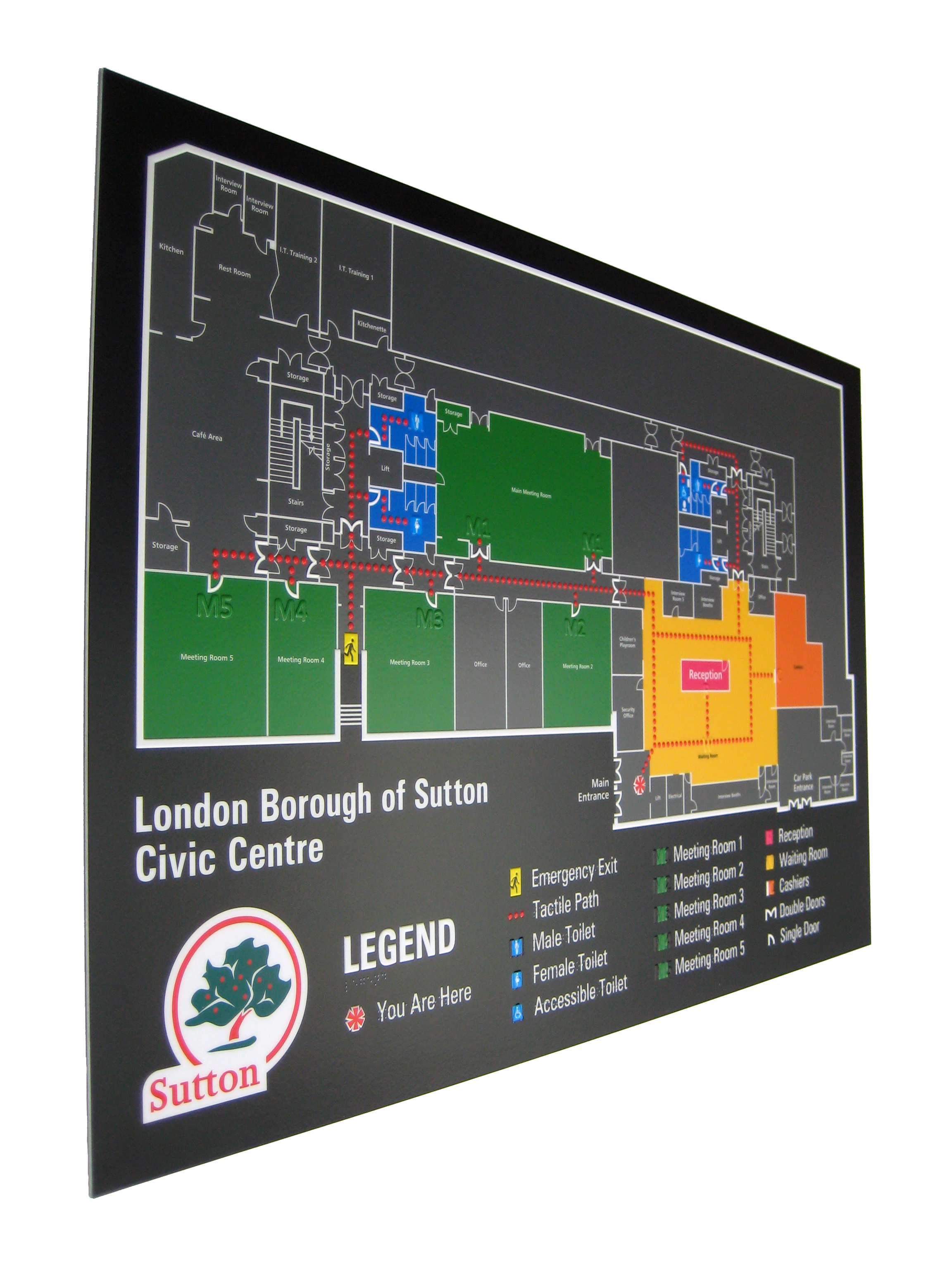


We offer design and branding services for those who do not have sign graphics prepared. Below are some guidelines to follow while creating your signage project.
General Guidelines for Raised Copy and
Braille Types
Raised copy for BrailliantTouch™ signage should be
no smaller than 5/8" in height. The styles for raised
copy should ideally be clear san-serif fonts with
enough spacing between font elements so letters do
not merge when formed. Examples of compliant copy
are shown at right.
More stylized font selections, like those shown at
right, are also possible. They are, however, still
required to meet the above criteria for letter height
and element spacing to be effectively rendered as
raised copy.
The letters shown at right are examples of fonts that
fall outside the guidelines. The font elements are
either too thin, too close together or too small to be
legible as raised elements.
Three Types of Braille are Used in our BrailliantTouch™ Systems.
The first type, Grade 1 Braille, is used in most countries
including Canada, the United Kingdom and Australia.
Grade 1 produces a letter-for-letter translation of a word
into Braille.
The second type, Grade 2 Braille, is used primarily in the
United States and employs characters that form a type of
Braille "shorthand".
The third type, California Grade 2 Braille, is used in the
US state of California and is identical to Grade 2, with the
exception of differences in spacing.
A general guideline for the use of any Braille type on our architectural sign systems is that the Braille must always be exactly 1/4" in height. In addition, Braille must be placed between 1/4" and 3/8" below any raised text or elements that
it accompanies.
Recommended file types
When sending in a design we recommend that you make sure your designated file is converted to either a vector based pdf, coreldraw version 19 or lower, illustrator css or lower or an eps file.